Table of Contents
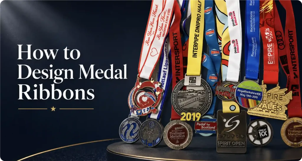
A custom medal ribbon does more than simply hold the medal around someone’s neck. It plays a big part in how the finished medal looks and feels, while also giving your event name, logo, or sponsors more visibility.
The wrong ribbon can make even a great medal feel off. The right one helps the whole award look more balanced and complete.
In this guide, we’ll walk you through the process from ribbon design to choosing the right style for different types of medals, so you can create a combination that looks right and works well for your event.
1. Choose the Ribbon Material
Most medal ribbons are made from polyester. It’s durable, prints well, and works for just about any standard event.
What you’ll usually need to choose is the finish.
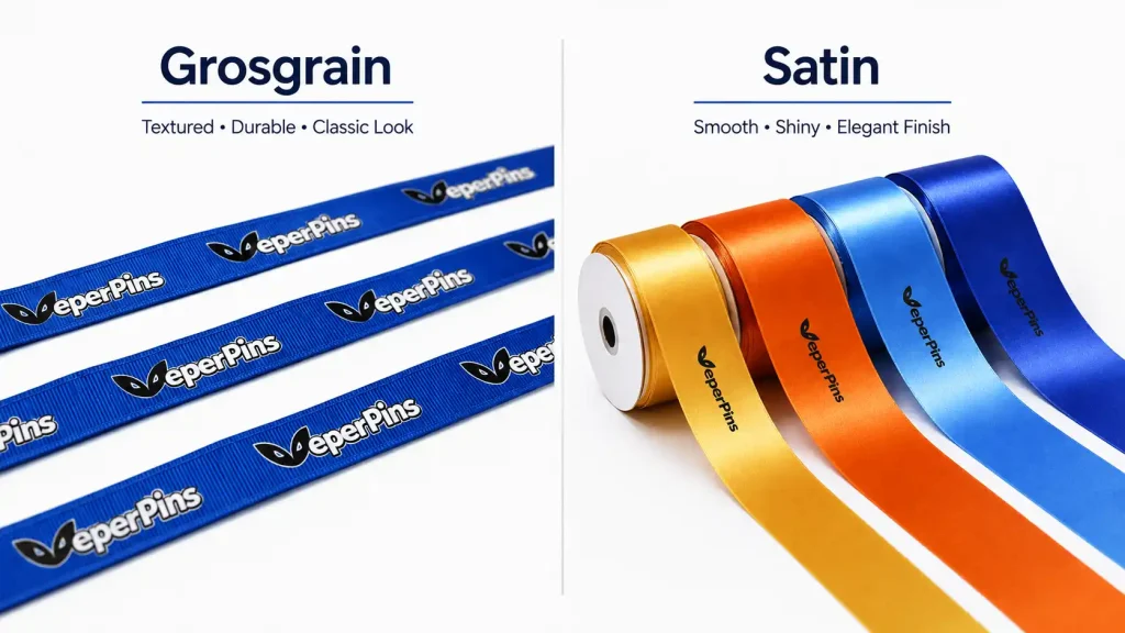
Satin has a smooth surface with a slight sheen. It works well for multicolor logos, gradients, and full-color designs, which is why you’ll often see it on marathon, 5K, and 10K medals.
Grosgrain has a more noticeable ribbed texture and a matte look. It’s a good fit for simpler designs with an event name, school logo, or basic text.
Nylon is another option and is known for its strength, but it’s less common than polyester for standard event medals.
Choose satin for a smoother, more colorful look, or grosgrain for something simpler and more traditional.
2. Picking the Right Ribbon Width
Once you’ve chosen the material and finish, decide on the width. It affects both comfort and how balanced the medal feels when worn.
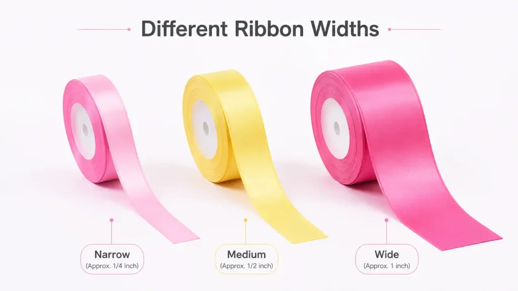
For most custom medals, 25mm (1″) and 38mm (1.5″) are the most common choices.
25mm (1″) works well for simple designs with a repeated event name or logo. It keeps the look clean without taking attention away from the medal.
38mm (1.5″) gives you more room for event names, logos, dates, or sponsor branding. It also tends to look better with larger or heavier medals.
You can also use the medal size as a starting point:
| Medal Type | Recommended Ribbon Width |
|---|---|
| Small school or kids’ medals | 0.75″–1″ |
| Standard medals around 2″ | 1″ |
| 2.5″–3″ event medals | 1″–1.25″ |
| Large medals over 3″ | 1.25″–1.5″ |
| Heavy medals or designs with more branding | 1.5″ |
If you’re not sure, 1″ is a good starting point for most medals. Move up to 1.25″ or 1.5″ for larger medals or when you need more space for branding.
3. Decide What Goes on the Ribbon
Ribbon space is limited, so keep the focus on what people actually need to see. For most events, the event name and logo are enough. If sponsors need to be included, add only the main ones.

Event Name
Keep the event name short whenever possible. For example:
- 2026 Charity 5K
- State Championship
- Annual Marathon
Long names usually have to be printed smaller, which makes them harder to read once the medal is being worn.
Repeat the Main Design
Instead of placing the main artwork in just one spot, repeat it along the ribbon so it stays visible from different angles.
For example:
Event Name → Icon → Event Name → Icon
This works especially well for races, school events, and tournaments where the ribbon may twist or shift while being worn.
Sponsor Logos
If you have one or two main sponsors, work them into the layout without crowding the ribbon.
For example:
Event Logo → Sponsor A → Event Name → Sponsor B
Avoid shrinking several sponsor logos just to fit them all. If there are too many, keep the main sponsors on the ribbon and move the rest to the back of the medal or other event materials.
Date, Distance, and Location
You can also add details such as the year, race distance, or city:
2026 · Half Marathon · Chicago, IL
These should stay secondary. If the ribbon already includes the event name and branding, there’s usually no need to add the date, distance, city, and a long tagline all at once.
4. Choose the Ribbon Color and Printing Method

The printing method mostly comes down to how detailed your design is.
Dye sublimation works well for designs with multiple colors, gradients, detailed artwork, or several logos. It also lets you print across the full ribbon instead of being limited to a small area.
Screen printing is a better fit for simpler designs, such as an event name, school logo, or artwork using just one or two colors on a solid ribbon.
If you don’t need any printing at all, a solid-color ribbon works just fine. It’s commonly used for school competitions, award ceremonies, and gold, silver, or bronze medals.
For color, start with what your event already uses. School colors, team colors, brand colors, or the event’s main color are usually the easiest choices.
Just make sure there’s enough contrast between the ribbon and the print. Light text shows up better on a dark ribbon, while dark text works better on a light one.
If the medal already has a lot of color, keep the ribbon simple. If the medal is mostly gold, silver, or bronze, the ribbon can carry more of the event color.
Common Medal Ribbon Design Mistakes
Too much content. If the text and logos have to be shrunk just to make everything fit, there’s too much on the ribbon.
Making the logo too small. A logo may look fine when you zoom in on the artwork, but that doesn’t mean it will be clear once printed. Fine lines, small text, and detailed logos are especially easy to lose.
Designing the ribbon separately from the medal. A good medal and a good ribbon can still look wrong together. Check the colors, proportions, and overall look as one complete award.
Adding sponsors at the last minute. This happens a lot with event orders. Decide early which sponsor logos need to be included so you don’t have to shrink everything later just to make them fit.
The Medal and Ribbon Should Work Together

VeperPins doesn’t sell ribbons separately. We match them as part of our custom medal service, based on the medal itself and what you need for the event.
Send us your artwork or idea, and whether you already know how to design medals or need help getting started, we’ll recommend a ribbon that fits the finished medal.