Table of Contents
Many pin designs look great on a computer screen. But once the artwork is scaled down to a real size, like 1 inch or 1.25 inches, the final result can look very different. Small text may be hard to read, thin lines can disappear, tiny details may blur together, and the colors on your screen may not match enamel colors exactly.
That doesn’t mean your design is bad. It simply means a metal pin is not the same as a printed product. The actual size, metal lines, color areas, enamel fill space, plating finish, and production method all affect how the finished piece will look.
In this guide, VeperPins will walk through the most common lapel pin design mistakes we see before production. We’ll also show you how to adjust your artwork so the final pins look cleaner, sharper, and closer to what you had in mind.
First, understand why pin design is different from regular printing
Custom lapel pins are not printed on paper, and they are not the same as regular stickers. With printed products, the artwork is usually reproduced on a flat surface, so tiny text, gradients, and photo-like details are much easier to achieve.
Pins are different. Whether you are making die struck pins or enamel pins, the design cannot always follow the same rules as normal printing. Many pin designs need metal lines to separate each color, then go through steps like recessed color filling, polishing, and plating.
To understand how design decisions affect the finished product, see our overview of the custom pin production process.
So, what mistakes should you avoid when designing custom lapel pins?
Mistake #1 — Using Too Much Tiny Detail
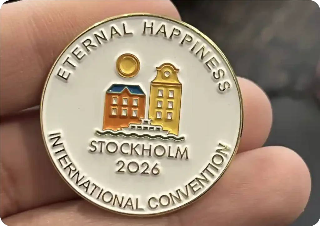
Most customers choose 1 to 1.5 inches when ordering custom lapel pins. This is a very common size, but it does have limits. If your design has a lot of tiny details, like hair on a person or animal, small windows on a building, or little icons inside a logo, those details may not show clearly on the finished pin.
The reason is simple: when a design gets too small, all the thin lines and tiny spaces can start to run together. The pin may look great on your screen, but once it is made in metal at actual size, some details can become hard to see.
So before finalizing your artwork, we usually suggest asking yourself:
What is the main thing people need to see first?
Is it the logo? The name? The year? A character? Or just one simple symbol?
Keep the important parts, and remove the small decorations that do not really matter. In many cases, a cleaner design will look much better than a design that tries to include everything.
Here is an easy test: shrink your design down to the real pin size, or make the image about 150–200 pixels tall on your screen.
Can you still read the text? Can you still recognize the main shape?
If yes, the final pin will usually work well. If it already looks blurry or crowded, the design probably needs to be simplified.
Our advice is simple: make the most recognizable logo or icon the main focus, and simplify or remove the less important details.
| Pin Size | Best For |
|---|---|
| 0.75"–1" | Simple logos, icons, and designs without tiny text |
| 1.25" | Logos with short text or a simple name |
| 1.5" | Designs with more detail, such as club pins or event pins |
| 1.75"+ | Complex logos, mascots, detailed artwork, or extra text |
Mistake #2 — Making Text Too Small
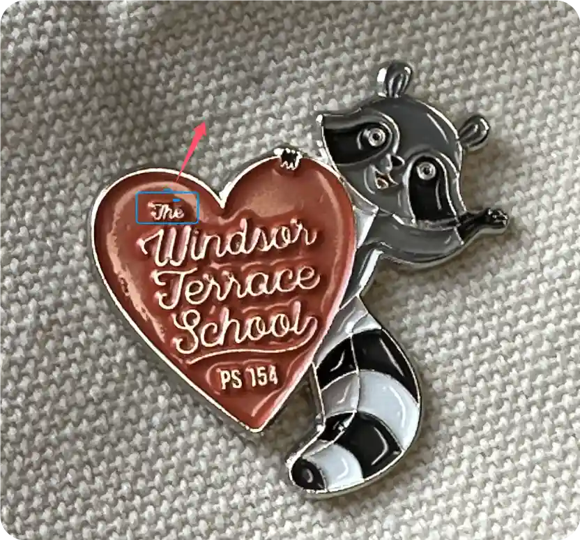
Thin fonts, handwritten fonts, and complicated serif fonts may look beautiful on screen, but they can be hard to read once they’re made into metal pins. This is especially true when there are too many lowercase letters, the font is too narrow, or you try to wrap the school name, event name, year, and slogan all around the pin. Once the design is reduced to the actual pin size, the text can easily look crowded and blurry.
How to fix it
Choose a bolder, cleaner sans-serif font, such as Arial Bold, Helvetica Bold, Montserrat SemiBold, or Poppins SemiBold. These fonts have cleaner strokes and clearer letter shapes, so they are much easier to read on custom lapel pins.
Try to avoid thin serif fonts like Times New Roman. Also stay away from overly decorative handwritten fonts or very narrow condensed fonts.
You can still include the school name, year, or event name, but don’t try to squeeze everything into one small pin. In most cases, it’s better to keep only the brand name, the year, or one short and simple slogan.
Mistake #3 — Using Too Many Colors
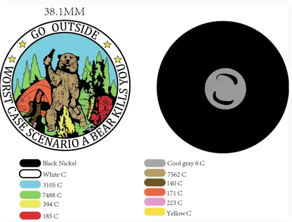
It’s tempting to include your brand colors, secondary colors, shadows, and every small detail. But remember, a pin is tiny. When too many colors are packed into a small space, the logo, text, and main artwork can lose focus.
For most designs, 3–5 colors are enough. This keeps the pin clean, easy to read, and more recognizable at actual size. A simple four-color design often looks much better than one filled with ten different colors.
Too many colors can also make production more difficult. Extra enamel colors may increase the cost, and more small color areas can raise the risk of uneven filling or color overflow.
How to fix it:
Start with your main brand color, then add only the supporting colors you really need. You can also use the plating color — such as gold, silver, black nickel, or antique copper — as part of the design instead of adding another enamel color.
Mistake #4 — Ignoring the Plating Finish
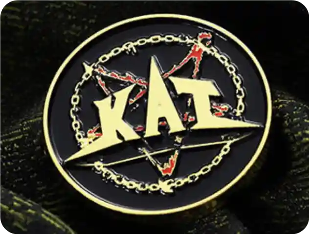
Plating is not just a final detail. It shows on the metal lines, borders, and raised areas, so it can change the whole look of your pin.
But plating is not the same as enamel color. Most pins use one plating finish only. Dual plating is more common on larger challenge coins, but for small pins, it can be expensive and may not look clean.
Also, plating colors are not flat colors. Black nickel is not pure black — it has a dark gray metallic shine. Antique copper is not just brown — it has a darker, vintage metal look.
Tip:
Choose gold or silver for a clean look, black nickel for stronger contrast, and antique copper or antique silver for a vintage feel. Don’t choose plating by the name alone. Always check how it works with your full design.
Mistake #5 — Not Using Pantone Colors Correctly
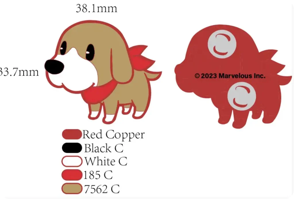
For soft enamel or hard enamel pins, it’s best to confirm colors with Pantone numbers, not just RGB colors from your screen.
Computer and phone screens can show colors differently, and RGB colors are not a reliable standard for enamel filling. If you only send a picture to the factory, the final color may look “close,” but not accurate enough.
Tip:
If you already have brand colors, use the correct Pantone numbers in your design.
If your artwork only has RGB, CMYK, or colors picked from an image, ask the supplier to convert them to the closest Pantone colors before production. This helps reduce color differences between the artwork and the finished pins.
And if you feel the RGB color still doesn’t match the Pantone option well enough, contact our sales team. We can send you some sample pins for reference.
Mistake #6 — Confusing Soft Enamel with Hard Enamel
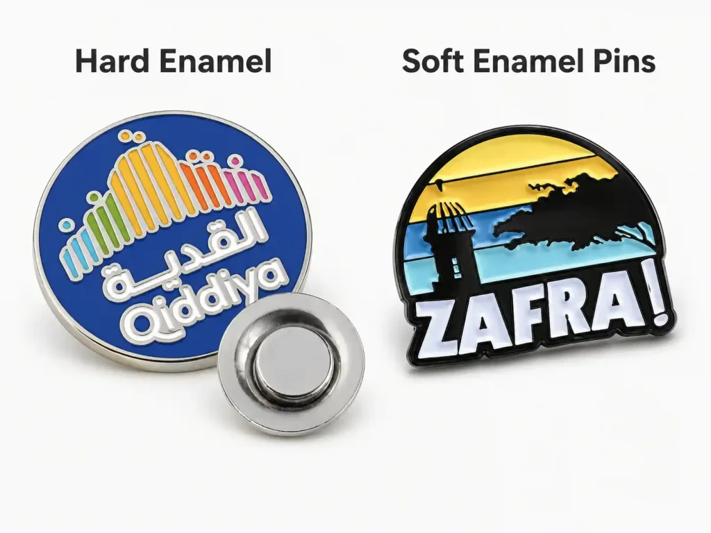
Many customers think hard enamel is always better than soft enamel, so they choose hard enamel for every design. But for custom pins, the process should depend on the design details.
If your design has small text, thin lines, a detailed logo, cartoon faces, animal outlines, or many small color areas, soft enamel is usually the safer choice. The raised metal lines help keep the edges clear and the details easier to see.
Hard enamel works better for simple, clean designs, such as brand logos, larger color areas, and minimal text. The surface is polished smooth, so the finished pin looks cleaner and more refined.
Tip:
Choose soft enamel for detailed designs. Choose hard enamel when the design is simple and you want a smooth, premium look. Don’t pick hard enamel just because it sounds more expensive — the wrong process can make your design less clear.
Still not sure which one fits your design? You can read our guide on the difference between soft enamel and hard enamel pins.
Mistake #7 — Making the Shape Too Sharp
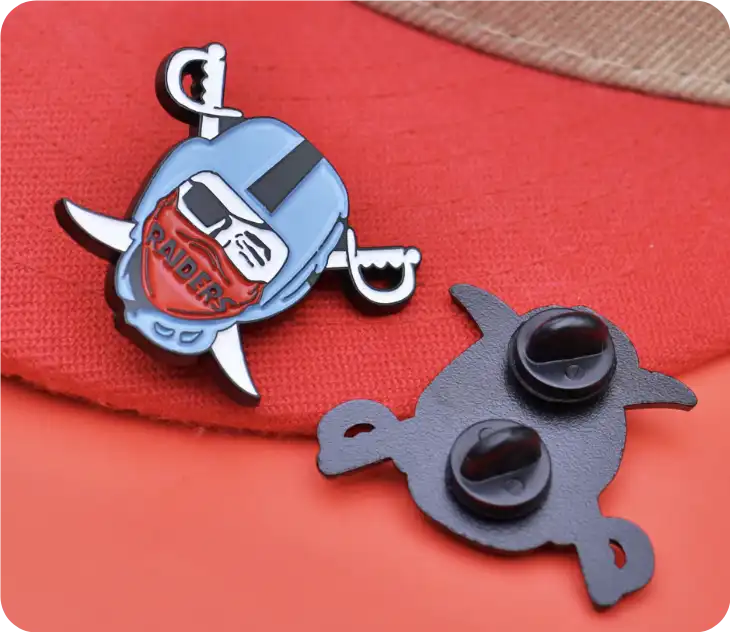
Some designs have sharp elements, such as lightning bolts, flames, wings, or antlers. They may look bold on screen, but once they are made into small pins, the thin or sharp parts can look weak, and the finished pin may not look as clean as the artwork.
Tip:
Keep the special shape, but don’t make the lines too extreme. Slightly round the sharp corners and make thin connecting areas a bit thicker. A good pin is not about being as complicated as possible — it should still look clear and balanced when scaled down.
Mistake #8 — Picking the Wrong Pin Size
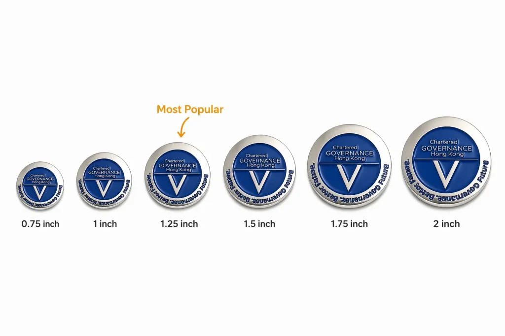
A pin is not better just because it’s bigger, and it’s not automatically more delicate because it’s smaller. If the size is wrong, even a good design can lose its impact.
If the pin is too small, you may have to shrink the text, logo, and small details too much. In some cases, you may even need to remove parts of the design just to keep it readable.
But bigger is not always better either. If a pin is too large on a jacket, hat, or bag, it can look bulky and less refined. And if your design is very simple but you choose a 2-inch size, the whole pin may feel a little empty or unbalanced.
Tip:
Think about where the pin will be worn first. For everyday wear, company logos, or school events, 1–1.5 inches usually works well. If your design has a mascot, character, detailed artwork, or more text, 1.5–2 inches may be a better choice.
The easiest way to check is to print the design at the actual size and place it on a shirt, jacket, hat, or bag. If the text is hard to read, make the pin bigger or simplify the design. If it looks too large or awkward, go smaller.
Mistake #9 — Choosing Only by the Lowest Price
Custom pins may look simple, but making them well takes experience.
Your artwork needs to be adjusted for production. The mold needs to hold the small details. The colors need to be filled cleanly. If one step is done poorly, the final pins may have blurry lines, color overflow, rough surfaces, or details that don’t match the artwork.
So don’t choose a supplier only because they are the cheapest. A low price can sometimes mean more problems later.
Tip:
Don’t just ask for the price. Check if the manufacturer has made similar pins before, whether they can spot design issues, and whether the quote is clear.
Be careful with prices that are too low, and don’t blindly trust the highest price either. Choose based on experience, communication, past work, and price together.
Follow These 9 Tips for a Smoother Custom Pin Order
Many problems do not start during production. They can often be avoided from the beginning.
When you pay attention to these details early, communication becomes easier, revisions are reduced, and the finished pins are more likely to match what you had in mind.
If you are still not sure what to do, you can contact VeperPins. We can help you spot possible issues before production, provide clear pricing with no hidden fees, and keep you updated throughout the process.