Table of Contents
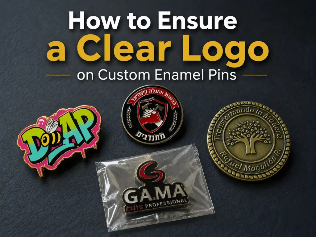
One of the biggest concerns people have when ordering company logo enamel pins is whether the design will still look clear once it becomes a real product.
A logo that looks perfectly sharp on a computer screen can look very different when it is reduced to the size of a metal pin. The final result depends on things like pin size, line thickness, text size, color separation, and how much space there is between small details.
If the original artwork is too complicated, some parts may need to be simplified. In other cases, increasing the pin size or using printing for certain details may work better.
A common mistake is assuming that a high-resolution logo is all you need. Resolution helps, but it cannot fix lines that are too thin to manufacture or color areas that are too small to fill cleanly.
Below, we’ll look at why logo details get lost and what you can change to keep your design clear and recognizable.
Why Logos Lose Detail When Made Into Enamel Lapel Pins
Enamel pins are made with raised metal lines that separate and hold the enamel colors. Because of that, very small or complicated details do not always translate well from digital artwork to a finished pin.
Here are four common reasons.
Small Sizes Leave Less Room for Detail
Many badges are made around 1 inch, or roughly 2.5 cm, but that is not a fixed rule. As the size increases, there is more room for small lettering, thin lines, and detailed artwork.
A design that feels spacious on a computer screen can become crowded very quickly once it is reduced to pin size.
Thin Lines and Tiny Color Areas Are Harder to Reproduce
Around 0.2 mm for metal lines and 0.3 mm for color-filled areas can be useful production references, although the exact limits vary by manufacturer, material, and enamel process.
The basic idea is simple: if a line is too thin, it may not form cleanly. If a color area is too narrow, it becomes harder to fill consistently.
Gradients and Shadows Do Not Translate Well Into Traditional Enamel
Traditional enamel works best with clean, separated blocks of color. Smooth gradients, photo-like shadows, and very subtle color changes are much harder to reproduce directly.
If those effects are important to the design, they can often be simplified or handled with printing instead.
Small Text and Thin Fonts Can Lose Readability
Text is often one of the first things to become difficult to read when a logo is reduced.
Type smaller than about 6 pt can lose definition, especially when the letters are tightly spaced. Thin serif fonts such as Times New Roman can also be harder to reproduce because their finer strokes may disappear or fill in.
Simple fonts with slightly heavier strokes usually hold up better.
How to Adjust Your Logo So It Stays Clear
Once you know why details disappear, the next step is deciding what really needs to stay.
The goal is not to strip the logo down as much as possible. It is to figure out which elements make the brand instantly recognizable and which details can be simplified without changing its identity.
Take McDonald’s as an easy example. The yellow arches and the red-and-yellow color combination are enough for most people to recognize the brand. A slogan, tiny supporting text, or extra decorative detail is not necessary for that recognition.
Start by identifying the most important parts of your logo:
- Outer shape
- Main icon or graphic
- Brand name
- Core brand colors
Then divide the remaining details into three groups:
Once you know what matters most, you can start making practical changes:
- Thicken very fine lines
- Enlarge the brand name
- Remove tiny slogans or supporting text
- Add more space between letters and graphics
- Turn gradients into two or three solid color steps
- Combine small color areas that look almost the same
- Keep the original proportions and overall silhouette
The point is not to redesign the logo. It is to remove details that would disappear anyway and keep the parts people actually recognize.
The Right Size and Production Method Matter Too
Simplifying the logo is only part of the process. You also need a pin size and production method that fit the artwork.
For a simple icon or a logo with very little text, 1–1.25 inches is often enough. If the design includes a full company name, several color areas, or more internal detail, around 1.5 inches usually gives the artwork more breathing room.
The production method should follow the design as well. Clean, solid-color logos work well with soft or hard enamel. If the artwork includes gradients, shadows, or very small details, a printed pin may give you a better result.
Turn Your Logo Into a Pin People Recognize
The goal of custom logo pins is not to squeeze every part of the original artwork into a small piece of metal. It is to make sure someone can look at the finished pin and immediately recognize the brand behind it.
A clear, easy-to-read design does a much better job of communicating that identity. Before sending your artwork into production, it is also worth checking these common design mistakes so you can avoid problems that are easy to catch early.
VeperPins can review your artwork, check the small details, and recommend a size and production method that fits your logo. When you’re ready, send us your design and we’ll help turn it into a custom enamel lapel pin that still looks like your brand.