
Table of Contents
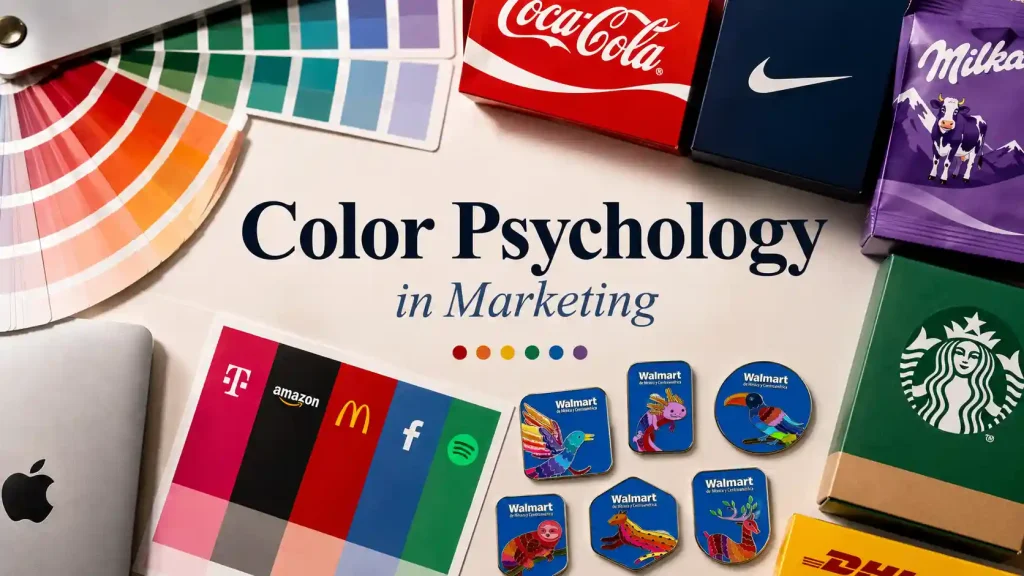
The exact same design can feel completely different depending on the colors you use. Black and gold can make it look more premium. Blue and white can make it feel cleaner and more professional. Red and black can give it a stronger, more energetic look. A lot of the time, we start forming an impression before we have even paid much attention to the brand name.
But there is no fixed formula for color. Navy blue and light blue can create very different impressions, and the same shade of red can feel completely different on a sports brand than it does on a skincare product.
This article is not just about what different colors are supposed to “mean.” It is about how color shapes brand perception, and why the way colors are combined can sometimes matter more than the individual colors themselves.
Does Color Really Influence Consumers?
Yes. When someone sees a product package, logo, ad, or website for the first time, color often starts shaping that first impression before the copy does.
Color can also affect what gets noticed. Red is often associated with promotions and discounts. Blue is widely used by banks, technology companies, and insurance brands because it can feel stable and professional. Black is often used to create a more polished, premium look.
But color psychology in marketing is not as simple as “blue means trust” or “red makes people buy.” Research on color psychology has found that color can influence emotion, cognition, and behavior, but those effects also depend on context, culture, and personal experience.
Color is better understood as something that quietly shapes how people perceive a product rather than something that determines whether they will buy it.
What Do Different Colors Usually Communicate?
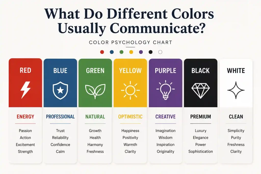
The Color Psychology Chart below gives a quick look at some common associations and where these colors are often used.
| Color | Common Feel | Common Uses | Watch For |
|---|---|---|---|
| Red | Energy, excitement | Food, sports, promotions | Can feel intense |
| Blue | Calm, professional | Tech, finance, B2B | Can feel cold |
| Green | Natural, healthy | Outdoor, wellness, food | Shade matters |
| Yellow | Bright, optimistic | Retail, entertainment | Can feel overwhelming |
| Purple | Creative, refined | Beauty, lifestyle | Shade changes the mood |
| Black | Strong, premium | Fashion, luxury | Can feel heavy |
| White | Clean, simple | Skincare, tech, healthcare | Can feel empty |
These are common associations, not fixed rules. The same color can feel very different depending on the product, culture, and brand around it.
The more useful question is not “What does this color mean?” but “What will this color make people feel when they see it on this product?”
Research on color and brand personality has also found that hue, saturation, and brightness can influence how consumers perceive a brand.
The Same Color Can Feel Completely Different in Another Shade

Blue is an easy example. Light blue tends to feel softer and lighter, which is why it shows up so often in baby products, personal care, and products meant to feel fresh or gentle. Navy blue feels more grounded and serious, so it is a common choice for finance, technology, and corporate branding.
Pink works the same way. Pale pink feels softer, while hot pink is much harder to ignore and tends to show up more often in fashion, trend-driven products, and brands aimed at younger audiences.
Green can change just as much. Olive green often brings outdoor, natural, and rugged associations, while neon green is much louder and is commonly used in sports, streetwear, or designs built around speed and energy.
Color Combinations Matter More Than a Single Color

Think about the designs around you that immediately feel “premium” or “trustworthy.”
Navy + White: Navy already feels fairly grounded, and pairing it with white makes the overall design look cleaner and sharper. That is one reason this combination is so common in finance, technology, and corporate branding.
Black + Bright Gold: Black feels solid and restrained, while gold naturally brings to mind precious metals and decorative finishes. Together, they are often used in more formal or premium-looking designs.
Red + Black: Black tones down some of the restlessness of pure red without taking away its visual impact. This combination is common in sports, motorsports, and streetwear.
Forest Green + Cream: Forest green already has a strong connection to nature, while cream feels softer than pure white. Together, they create a more relaxed, grounded look that shows up often in outdoor, food, and lifestyle branding.
In real buying situations, people are not standing there trying to remember the exact shade of blue or green a brand used. What tends to stick is the overall visual impression—whether something feels premium, natural, professional, young, or energetic.
Industry and Context Can Change What a Color Means
Color psychology often gets reduced to ideas like “red means passion” or “green means nature,” but that is not enough once you get into actual products and brand design.
The meaning of a color changes depending on where and how it is used.
Take the custom enamel pins we make as an example. The same red can suggest completely different things depending on the subject.
- Red on a firefighter commemorative pin may bring to mind courage, action, and warning. On a racing or event pin, it feels more connected to speed and energy. On a food brand, the same color may be used to suggest heat, bold flavor, or intensity.
- Olive green works the same way. On an outdoor brand, it can feel connected to nature and the outdoors. In an environmental project, it can reinforce sustainability. On a military- or tactical-style pin, it may come across as durable, disciplined, and functional.
That is why talking about what a color “means” without looking at the industry is not very useful.
A better question is: What are people in your market already used to seeing this color communicate?
Consumers Already Have Their Own “Color Expectations”

People already have expectations about how certain types of products are supposed to look.
One packaging study found that when orange juice was shown in an unexpected blue package instead of the more familiar orange color, people spent an average of 176 seconds on the product page compared with 144 seconds for the conventional package. In a separate purchase-choice experiment, however, the blue package was selected less often.
That points to something very practical: getting more attention does not automatically mean getting more sales.
We see a similar effect when designing custom enamel pins. Keep the artwork exactly the same and change only the palette, and the entire personality of the piece can shift.
- Navy + White: More corporate, tech-oriented, or team focused
- Black + Gold: More formal, commemorative, and premium
- Red + Black: Faster, stronger, more competitive
- Olive Green + Cream: More natural, outdoorsy, and rugged
- Pink + Purple: Younger, more creative, and more expressive
The artwork, lettering, and size have not changed, but the “identity” of the product has.
Choosing colors is not just a final step where you fill in a few empty areas. It helps determine what people think the product is the moment they see it.

When Brand Colors Become Physical

The HEX or RGB colors you see on a monitor come from light emitted by the screen. On packaging, fabric, or any other physical product, what you see comes from light reflecting off the surface of the material. Pantone has also pointed out that colors simulated on a screen cannot perfectly reproduce the appearance of a physical color standard.
In practice, the process often looks something like this:
HEX / RGB → Pantone → Physical Product
With enamel pins, the metal finish adds another layer. Bright gold can make the overall piece feel warmer and more decorative. Bright silver tends to look cleaner and more modern. Black nickel reduces some of the metallic brightness and can create stronger contrast with the enamel colors.
How Should a Brand Choose Its Colors?
Choosing brand colors is not just about picking what you personally like. It is also worth looking at what everyone else in your industry is already doing.
T-Mobile is a good example. Major U.S. telecom brands have developed very strong color identities over time: Verizon leans red, AT&T leans blue, and T-Mobile has made Magenta almost inseparable from its brand. In many cases, people can see a large field of that color without the full logo and still think of T-Mobile.
That is one reason competitor research matters when choosing a palette. A color may not be unusual on its own, but if it clearly separates you from the rest of the category and you use it consistently over time, it can become part of how people recognize the brand.
A few practical things to look at:
- Does the color fit the way you want the brand to feel?
- Will your target audience respond well to it?
- What colors are competitors already using?
- Does it help you look different from the rest of the category?
- Does it still work well across websites, packaging, and physical products?
There Is No Universal Formula for Color
In the end, there is no single set of color psychology rules that works for every brand.
How people respond to color depends on a mix of hue, brightness, color combinations, context, and audience. Change the shade, pair it with another color, or put it on a different type of product, and the impression can change completely.
If you plan to bring your brand colors into physical merchandise, you also have to think about what happens when those colors leave the screen and meet a real material. With custom enamel pin designs, color is only one part of the final look. Metal plating, contrast, and Pantone matching all affect how the finished piece turns out.


